

What is web accessibility and why is it important? Accessible design is, at its heart, simply good design. It involves effective, highly usable content and interfaces that are used to communicate with an audience.
Accessible web design can help your message reach a wider range of audiences.
It’s also important to note that accessible digital experiences can help drive business success. The ROD Group estimates that the world’s disabled population controls over $1 trillion in annual disposable income.
Read through our list of frequently asked questions to learn more about accessible design and get some tips for implementing it.
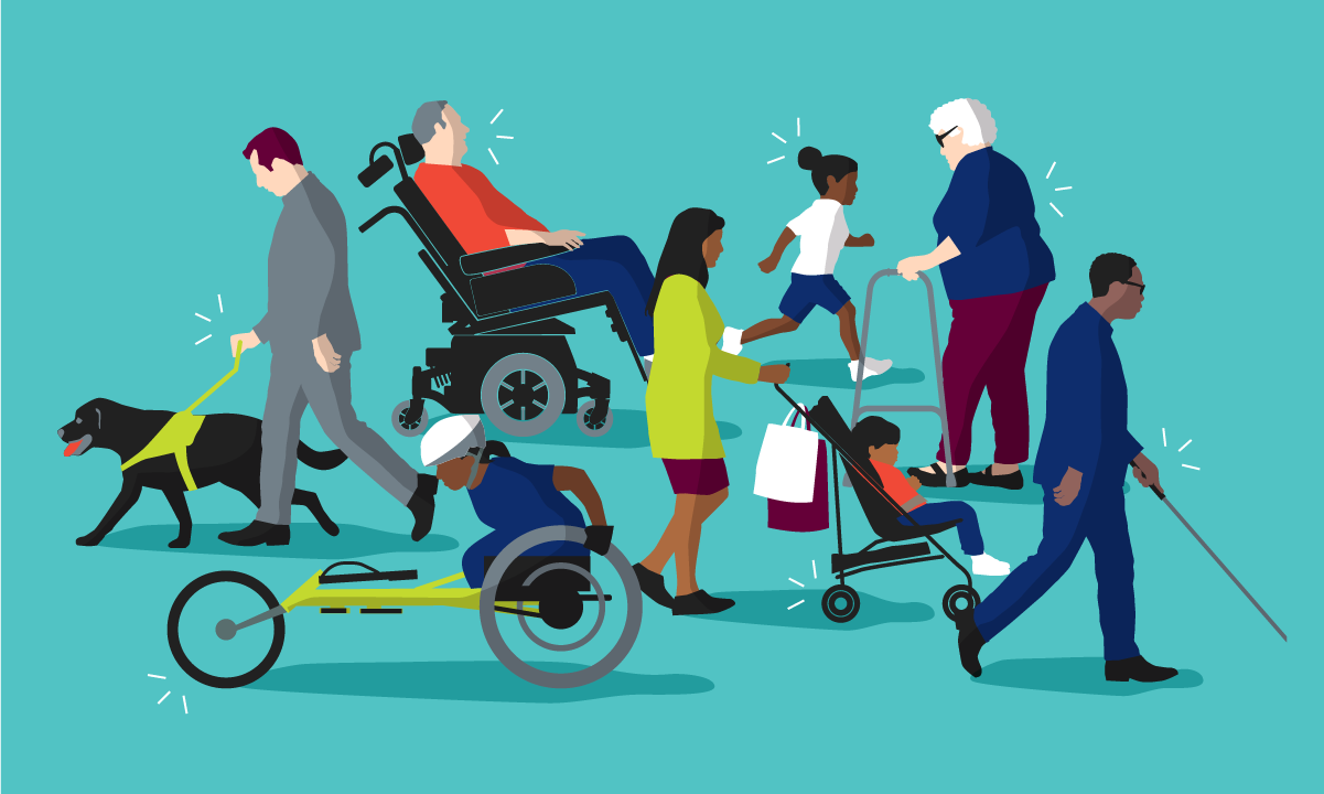
People with disabilities are not a single group. Designing with them in mind should not be seen as a barrier to innovation. You've probably been disabled before, but you may not have thought of it that way because disabilities are not always permanent. For example, having an amputated arm, having a broken arm, and carrying a heavy load of groceries with one arm illustrate various forms of permanent, temporary, and situational disabilities. Check out Microsoft’s Inclusive Design Toolkit for more information.
The accessibility of web design may not be top of mind for many companies. However, if only certain groups of people can access your online content or there are barriers that prevent people from accessing it, this can be considered discrimination. Access to information and communications technologies (like the web) is actually defined as a basic human right according to the United Nations Convention on the Rights of Persons with Disabilities. But don’t be overwhelmed. Getting up to speed on accessibility doesn’t need to be tackled all at once; even small changes can result in improvements that make a difference for your users.
Whether the condition is permanent, temporary, or situational, people with a disability use many tactics to help them navigate digital content. Assistive technologies, like switch controls and screen readers, are hardware and software installed on a computer or phone. Adaptive strategies, like resizing browser windows and font sizes, are customizable techniques usually controlled within the device’s settings. It’s important to design your content — on the front end and the back end — in a way that makes it possible for these technologies and techniques to work correctly.
Someone with a physical disability, like the permanent or temporary loss of motor function in their hands, might use a foot pedal switch control. Switch controls come in several configurations, including:
Button switches, which are activated using the hand, foot, or head, and can be single switches or multiple switches.
Sip-and-puff switches are triggered by sipping and puffing into a straw, which then mimics tabbing and clicking on a website.
Camera switches are usually built into accessibility settings on newer devices. These are used by tilting the head, making facial gestures, or tracking the point of gaze to help users navigate through webpages and apps.
All of these devices rely on the tab index of a webpage. When someone has no or limited dexterity, using a mouse or trackpad on a computer is hard. As a result, many users with physical disabilities use the Tab key on a keyboard to navigate through sites. Switch controls provide the same action as the Tab key.
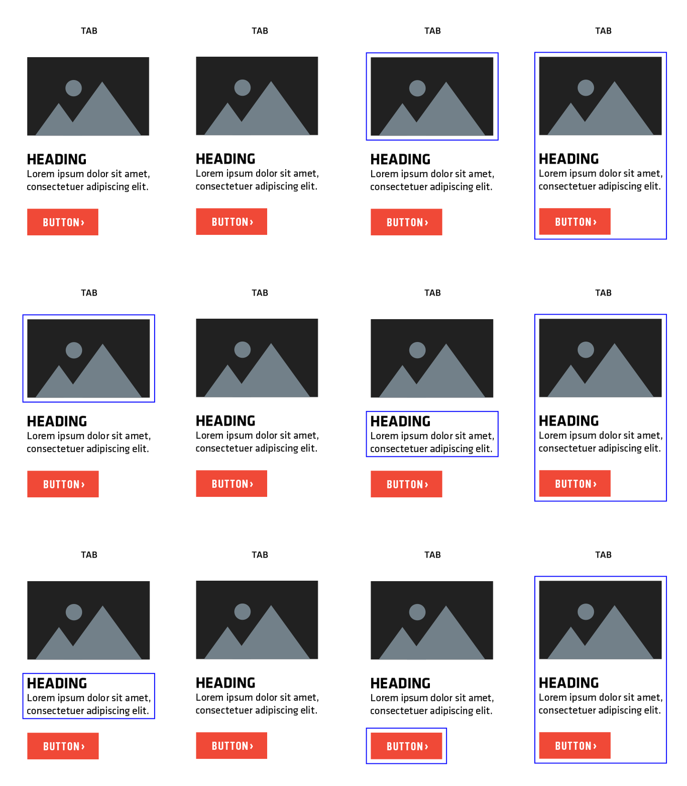
When an item is tabbed to, it has a focus state, which is a visual indicator that the item currently has keyboard focus. If there is no focus state, it can be impossible for users to know where they are on a page or what is actionable. To prevent this, design with clear focus states in mind and group items with the same action into one focus state. This gives users an easier experience with fewer unactionable items to tab through. In the example below, it takes three tabs to get through the same amount of actionable content. This is compared to one tab with a grouped focus state.

At least 2.2 billion people globally have a visual impairment. Those who are blind, partially blind, or have low vision might use a screen reader. It reads out loud everything onscreen, like text, headings, lists, buttons, and text alternatives for images. It’s crucial that your semantic markup (HTML tags that convey the meaning of the content contained within them) is correct. For example, if a screen reader navigates a correctly coded form, it will announce the name, role, and state of an element. It might say, "Select Terms and Conditions, checkbox, not checked."
Another essential element to keep in mind is image alt text. Screen readers will read alt text out loud, which can make cluttered pages difficult to listen to. Context is key. Consider the following image of a service dog:

Alt text with no context: A service dog.
Alt text on a page about service dogs for the blind: A service dog guiding its blind owner through the park.
Alt text on a page about adopting retired service dogs: An elderly service dog on its last walk with its owner.
If an image lacks alt text, screen readers will announce the image’s name. However, the name may not make sense to the user, so it’s important to choose file names that make sense if they are read aloud.
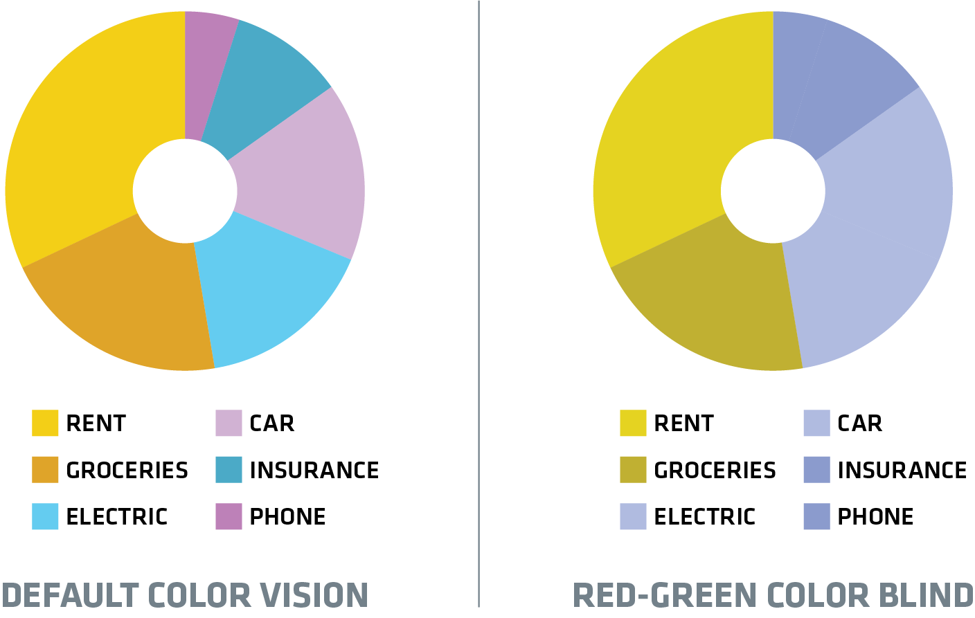
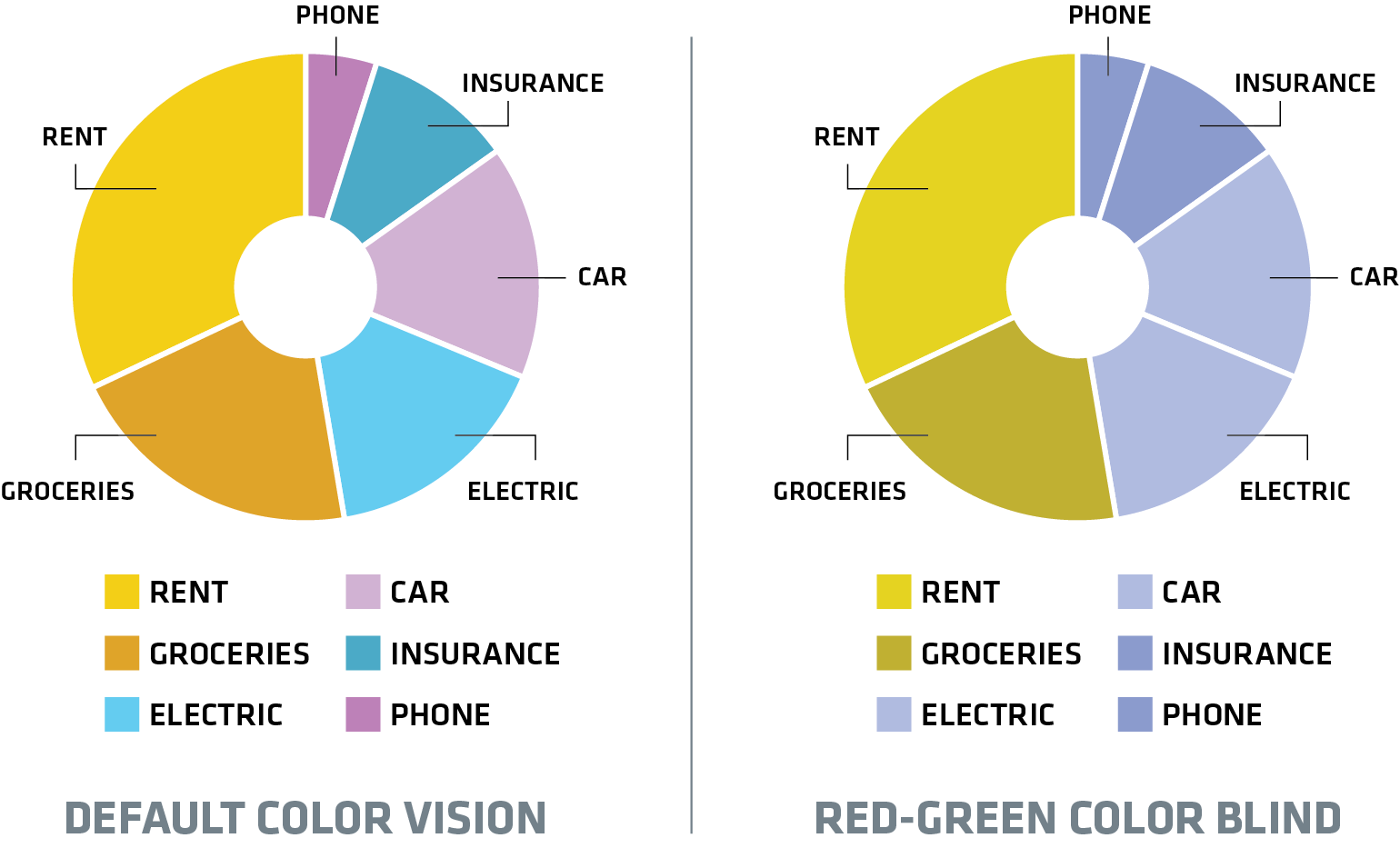
Another factor to consider in web design is color blindness, which affects about 8% of men and 0.5% of women. It can make it hard for users to access color-only information, so don't rely only on color for navigation or to tell items apart in design.
DON’T: Color used as the only method

DO: Color paired with other cues

Whether someone is deaf, hard of hearing, or simply in a loud environment, audio and video issues are the largest barriers when it comes to accessible content on the web. Closed captions are the most important assistive technology for those unable to hear. They show written dialogue and other audio elements (like music and background noises) during videos. They are essential for the permanently disabled but also for other users in many situations, including:
Those trying to watch a video in loud environments like an airport or cafe.
Those who cannot understand the spoken language well but can understand the written language better.
Those learning to read.
Take it a step further and add a written transcript to your video content. It includes all dialogue, narration, and other audible elements. This is useful for accessibility and SEO, and it doesn't require users to download video files.
People with conditions like autism, attention deficit disorders, brain injuries, dementia, dyslexia, and mental illnesses often use adaptive strategies to help them navigate the web. But they can only apply their adaptive strategies if the site is coded to allow modifications. Responsive, flexible design on the front and back end makes adjusting browser modifications like font styles, background colors, and margins simple.
While it’s easy to assume that people with speech impairments don't encounter challenges on the web because it’s mainly a visual medium, that is not always the case. All voice-based services should have an alternative option that does not require speaking. This thinking carries over to how we design on the web. If a “Contact Us” page has a phone number, it must also have a functioning form or email address as an alternative.
Accessibility testing and evaluation applications like accessiBi and UserWay make it easy for users to adjust these settings and for businesses to follow the Americans with Disabilities Act and conform with the Web Content Accessibility Guidelines (WCAG).
The WCAG are a set of technical standards set by the World Wide Web Consortium. They help improve web accessibility for people with many disabilities and provide a single, global standard. While extensive, they are essential. Keep these standards in mind as a starting point for accessible web design in these areas:
Color
Use actionable color differentiators with other visual cues, like underlining.
Use color combinations at a contrast ratio of at least 4.5:1.
Don’t rely on color alone as a navigation tool or as the sole method for differentiating items.
Text
Write content at a reading level of 7th to 9th grade or lower.
Provide definitions for technical jargon, unusual terms, and abbreviations.
Avoid generic link and button text such as “learn more” and “click here.”
Avoid text within images.
Provide alt text for any non-text content.
Code websites in a way that upon zooming, text wraps to the next line.
Left-justify long copy.
Animation
Provide a pause/mute button for animations longer than 5 seconds or that infinitely loop.
Make pause/mute buttons contrasted, easy to find, and with focus states.
Content shouldn’t flash or blink at a rate of more than three times per second.
Video
Provide captions for videos with audio.
Provide a written transcript.
Make sure onscreen text is large, contrasted, and easy to read.
If your business isn’t up to speed on accessibility, don't worry. You don't need to put every technique to work right away. Accessibility is a spectrum, not a single solution. For many businesses, it won’t happen overnight. Even small changes help, such as adding roles to tables or left-aligning text. These changes can give users massive benefits.
We should all try to do what we can to create better experiences for our users, regardless of their abilities. By keeping these benefits of accessible design in mind, we not only follow legal rules but also uphold ethical standards of inclusivity and fairness. If you’re ready to make your digital experiences more accessible, contact us to get started.